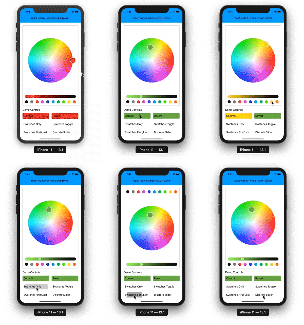
A color picker component for react native.
- Pure JS, lightweight, works on Android, iOS and Web
- Uses hue-saturation color wheel and lightness slider
- Selectable from color swatchs
- Smooth and discrete color slider
- Color change animations on wheel, slider and swatches
(This demo uses my react-native-advanced-ripple and react-native-elevation modules.)
npm install react-native-wheel-color-picker
import { Component } from 'react'
import { View, Text, ActivityIndicator } from 'react-native'

import ColorPicker from 'react-native-wheel-color-picker'

class App extends Component {
    render() {
        return (
            <View style={[]}>
                <ColorPicker
                    ref={r => { this.picker = r }}
                    color={this.state.currentColor}
                    swatchesOnly={this.state.swatchesOnly}
                    onColorChange={this.onColorChange}
                    onColorChangeComplete={this.onColorChangeComplete}
                    thumbSize={40}
                    sliderSize={40}
                    noSnap={true}
                    row={false}
                    swatchesLast={this.state.swatchesLast}
                    swatches={this.state.swatchesEnabled}
                    discrete={this.state.disc}
                    wheelLodingIndicator={<ActivityIndicator size={40} />}
                    sliderLodingIndicator={<ActivityIndicator size={20} />}
                    useNativeDriver={false}
                    useNativeLayout={false}
                />
                <SomeButton onPress={() => this.picker.revert()} />
            </View>
        )
    }
}

export default App- fixed a bug related to
useNativeDriver - no breaking changes
- added changelog section to README.md
- prop added:
wheelLoadingIndicator - prop added:
sliderLoadingIndicator - prop added:
useNativeDriver - prop added:
useNativeLayout - prop added:
disabled - prop added:
flipTouchX - prop added:
flipTouchY - prop added:
wheelHidden - fixed a bug related to
discreteLengthprop - no breaking changes
- prop added:
gapSize - prop added:
discreteLength - prop added:
swatchesHitSlop - prop added:
palette - prop added:
onInteractionStart - no breaking changes
- prop added:
shadeWheelThumb - prop added:
shadeSliderThumb - prop added:
autoResetSlider - no breaking changes
row: false use row or vertical layout
noSnap: false enables snapping on the center of wheel and edges of wheel and slider
thumbSize: 50 wheel color thumb size
sliderSize: 20 slider and slider color thumb size
gapSize: 16 size of gap between slider and wheel
discrete: false use swatches of shades instead of slider
discreteLength: 10 number of swatches of shades, should be > 1
sliderHidden: false if true the slider is hidden
swatches: true show color swatches
swatchesLast: true if false swatches are shown before wheel
swatchesOnly: false show swatch only and hide wheel and slider
swatchesHitSlop: undefined defines how far the touch event can start away from the swatch
color: '#ffffff' color of the color picker
palette: ['#000000','#888888','#ed1c24','#d11cd5','#1633e6','#00aeef','#00c85d','#57ff0a','#ffde17','#f26522'] palette colors of swatches
shadeWheelThumb: true if true the wheel thumb color is shaded
shadeSliderThumb: false if true the slider thumb color is shaded
autoResetSlider: false if true the slider thumb is reset to 0 value when wheel thumb is moved
onInteractionStart: () => {} callback function triggered when user begins dragging slider/wheel
onColorChange: (color) => {} callback function providing current color while user is actively dragging slider/wheel
onColorChangeComplete: (color) => {} callback function providing final color when user stops dragging slider/wheel
wheelLoadingIndicator: null wheel image loading component eg:
sliderLoadingIndicator: null slider image loading component eg:
useNativeDriver: false to use useNativeDriver for animations if possible
useNativeLayout: false to use onLayoutEvent.nativeEvent.layout instead of measureInWindow for x, y, width, height values for wheel and slider measurements which may be useful to prevent some layout problems
disabled: false disable all interactions
flipTouchX: false flip touch positioning on X axis, might be useful in UI with RTL support
flipTouchY: false flip touch positioning on Y axis, might be useful in UI with RTL support
wheelHidden: false if true the wheel is hidden, does not work with sliderHidden = true
revert() reverts the color to the one provided in the color prop
The MIT License (MIT)
Copyright (c) 2020-2024 Md. Naeemur Rahman (https://naeemur.github.io)
Permission is hereby granted, free of charge, to any person obtaining a copy of this software and associated documentation files (the "Software"), to deal in the Software without restriction, including without limitation the rights to use, copy, modify, merge, publish, distribute, sublicense, and/or sell copies of the Software, and to permit persons to whom the Software is furnished to do so, subject to the following conditions:
The above copyright notice and this permission notice shall be included in all copies or substantial portions of the Software.
THE SOFTWARE IS PROVIDED "AS IS", WITHOUT WARRANTY OF ANY KIND, EXPRESS OR IMPLIED, INCLUDING BUT NOT LIMITED TO THE WARRANTIES OF MERCHANTABILITY, FITNESS FOR A PARTICULAR PURPOSE AND NONINFRINGEMENT. IN NO EVENT SHALL THE AUTHORS OR COPYRIGHT HOLDERS BE LIABLE FOR ANY CLAIM, DAMAGES OR OTHER LIABILITY, WHETHER IN AN ACTION OF CONTRACT, TORT OR OTHERWISE, ARISING FROM, OUT OF OR IN CONNECTION WITH THE SOFTWARE OR THE USE OR OTHER DEALINGS IN THE SOFTWARE.
