Scale the entire UI design proportionally.
Button, image, font, every widget is scaled simultaneously.
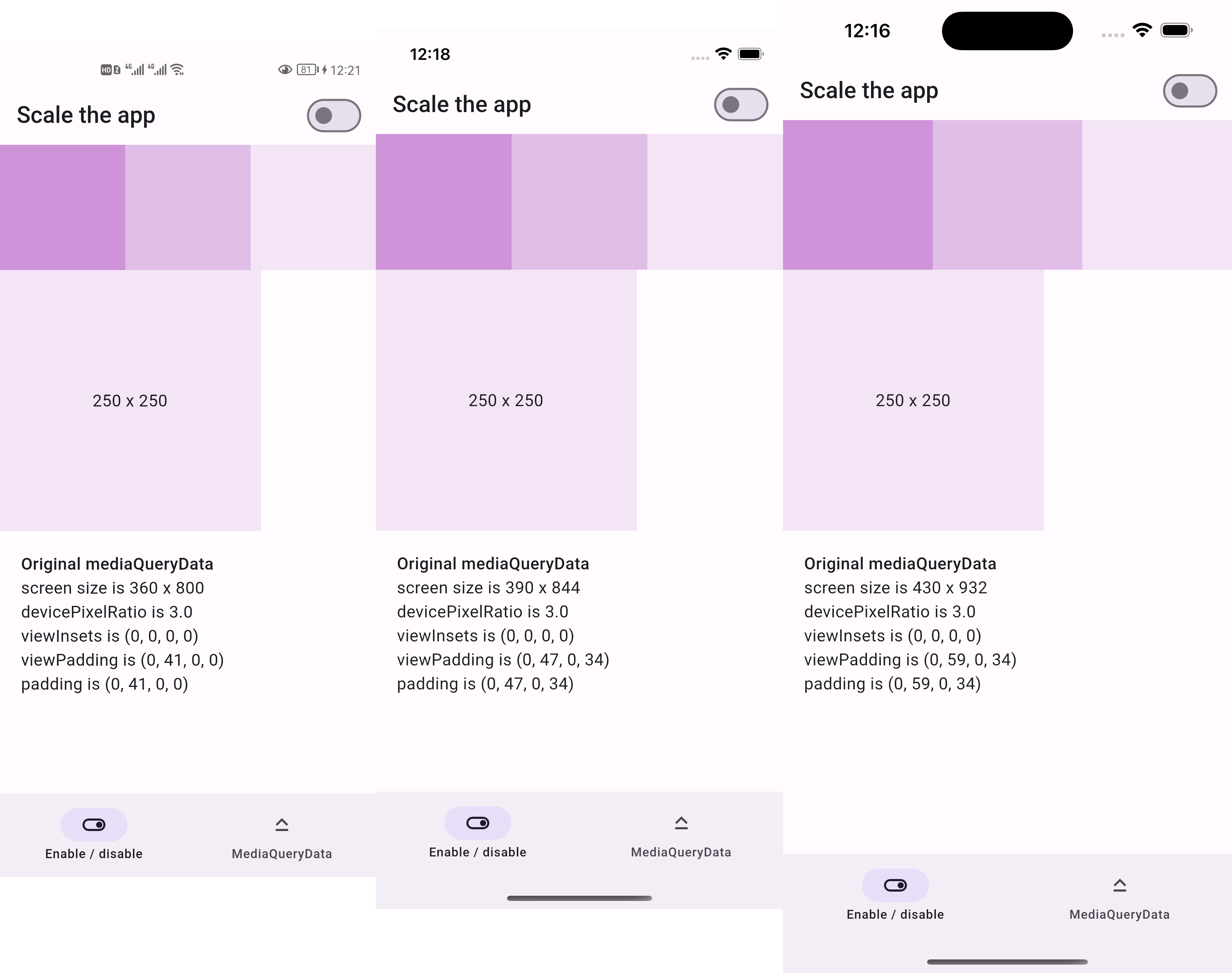
Before:
- 250x250 square is the same size across devices
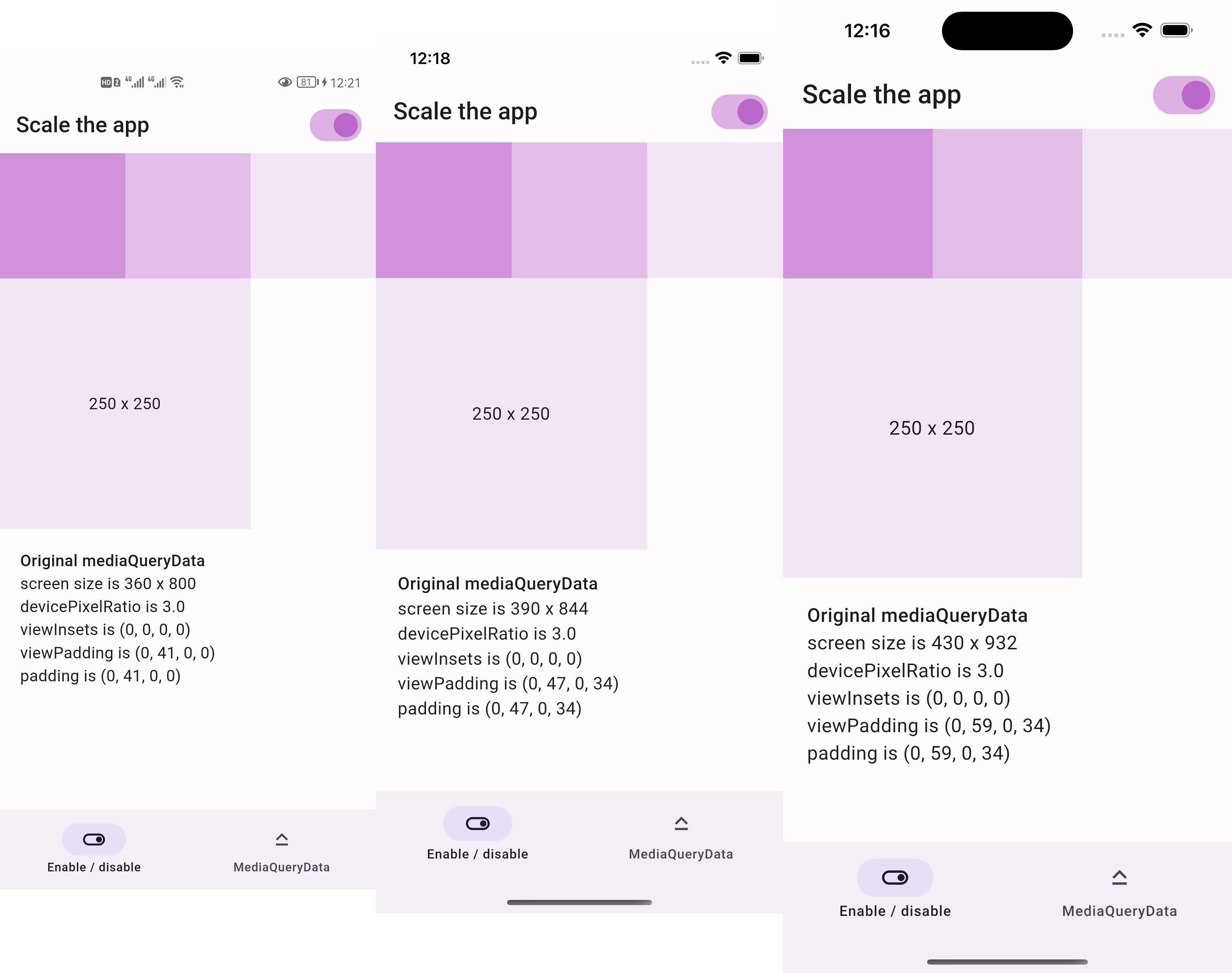
After:
- 250x250 square is two thirds the screen width across devices
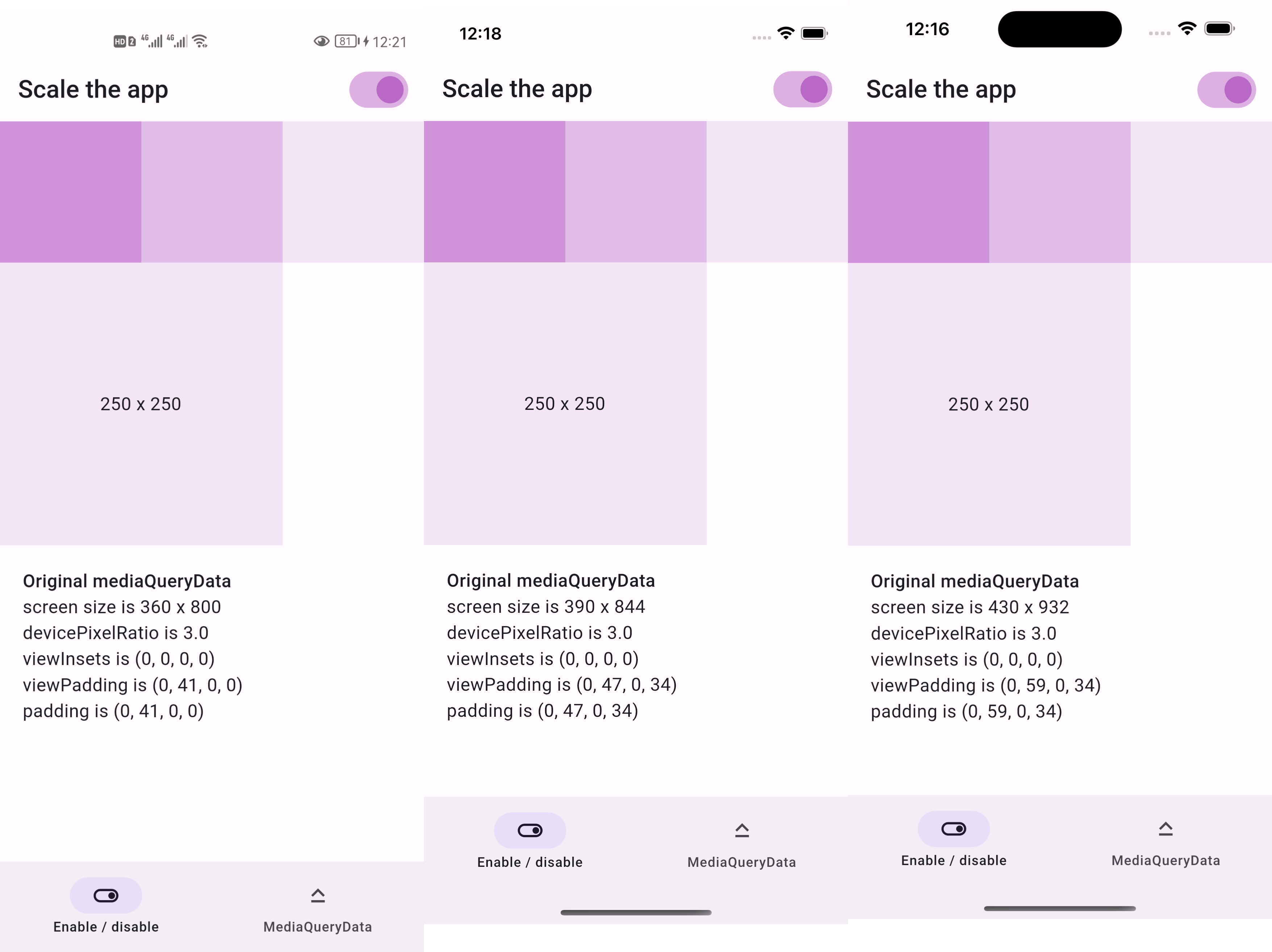
- if we resize the screenshots above to be the same width
- then everything appears the same size as below
https://lastmonopoly.github.io/flutter_web_app/scaled_app_demo/
Use this package in your Flutter app when:
- your UI design is fixed-width
- you want to scale the entire UI, not just part of it
Firstly, replace runApp with runAppScaled
void main() {
  // 1st way to use this package
  runAppScaled(const MyApp(), scaleFactor: (deviceSize) {
    // screen width used in your UI design
    const double widthOfDesign = 375;
    return deviceSize.width / widthOfDesign;
  });
}
Or, replace WidgetsFlutterBinding with ScaledWidgetsFlutterBinding
void main() {
  // 2nd way to use this package
  // Scaling will be applied based on [scaleFactor] callback.
  ScaledWidgetsFlutterBinding.ensureInitialized(
    scaleFactor: (deviceSize) {
      // screen width used in your UI design
      const double widthOfDesign = 375;
      return deviceSize.width / widthOfDesign;
    },
  );
  runApp(const MyApp());
}
Then, use MediaQueryData.scale to scale size, viewInsets, viewPadding, etc.
class PageRoute extends StatelessWidget {
  const PageRoute({Key? key}) : super(key: key);

  @override
  Widget build(BuildContext context) {
    return MediaQuery(
      data: MediaQuery.of(context).scale(),
      child: const Scaffold(...),
    );
  }
}
Optionally, update ScaledWidgetsFlutterBinding.instance.scaleFactor to enable / disable scaling on demand.


